Still life project – still life group in tone
Posted: December 17, 2011 Filed under: Still life project - Part Two Leave a commentThis exercise involved drawing another still life group but this time I needed to draw the different tones using different colours. I chose to use different shades of the same colour, blue. I also experimented by drawing in oil pastels. I have very limited experience of using oil pastels so I was using this exercise to also push my boundaries.
I am happy with result of the drawing. I like the way that the different tones are represented by the different colours. The exercise made me examine in detail the different tones of the objects.
I also loved using the oil pastels as they produce beautiful, bold colours. I read some instructions on how to use them and have realised that they do not just produce a textured effect but smooth blocks of colour. I enjoyed immensely using them as they enabled me to be expressive in my drawing and I was able to layer colours, which I found effective.
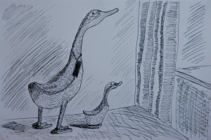
Still life project – Still life group using line
Posted: December 17, 2011 Filed under: Still life project - Part Two Leave a commentThis exercise involved drawing a group of objects in a medium of my choice. I chose two ornamental wooden ducks. I felt there was a natural connection between them as one was large and the other small. I also followed the suggestion of adding more background detail to show the context of the objects in their surroundings.
This drawing was truly experimental for me as I have never attempted a drawing using dip pen and ink. I had to have the confidence to use the pen without first drawing in pencil. This was a great challenge but I feel I have represented the overall shapes and relationships between the objects correctly. I had more problems trying to replicate the texture of the wood. The objects were formed from different woods and this is shown in the drawings.
I am not sure whether the drawing is successful in the sense that it looks good but I feel I have learned a lot about using the dip pen so is therefore successful in my learning experience. I enjoyed using the pen and the freedom of movement you can achieve with it. I also experimented with using different marks to represent tone and texture and I found the pen to be excellent for this exercise.
Still life project – final thoughts (check and log)
Posted: December 16, 2011 Filed under: Still life project - Part Two Leave a commentWhat aspects of each drawing have been successful, and what did you have problems with?
Using line exercise (ducks) :
I feel that the texture has been conveyed ok using the dip pens and it was nice to experiment with different marks to do this.
The drawing looks a bit lifeless and flat though but I am not sure why. Maybe it is the lack of tone?
It was a real challenge to use the dip pens as I do not have much experience and trying to create tone was difficult.
Tone exercise (candlestick) :
I am pleased with the result of this drawing. I feel it looks three-dimensional and that the tones look good. I think it looks interesting all being different shades of the same colour.
It was difficult to get fine detail into the drawing as the oil pastels were quite thick. I had to be content with an overall impression.
It is possible some would not like the artificial look of the blue.
Did you manage to get a sense of depth in your drawings? What elements of the drawings and still life groupings helped to create that sense?
The second drawing of the candlestick group was more successful in this regard than the first drawing of the ducks.
The grouping of the candlestick, the incense burner and small candlestick helped to create depth as they were placed at different distances to the viewer.
The ducks were practically side by side which probably on reflection has contributed to the lack of depth in the drawing. My experience so far should have told me that overlapping items helps to create depth.
What difficulties were created by being restricted to line or tone?
It was difficult to create depth with just lines. I felt it was easier to create the sense of depth with tone. But the tonal drawing lacked the definition I would have liked. It appears that tone adds depth and line, detail.

